Friday, August 23, 2013

Olive Ridley Resort-Costa Rica


"Olive Ridley Resort" 


These are just a few compositions I had put together for a made up company I named Olive Ridley Resort in Costa Rica. This project was for my Corporate ID and Branding class whose objective was to create integrated marketing products that would be found in a real hotel or resort. The top is the in room stationary of a pen, big paper, post it notes and business card of the resort. Coming up with the logo was a challenge but I do like the outcome of what I created. The colors I wanted to have a beach feel along with very girly sense the logo has a flower in it, I thought it would be appropriate to have it pink. I like the way my room keys turned out that one would find in a hotel or resort. The room keys are festive and welcoming. If I stayed at a hotel with these keys I'd probably keep it as a souvenir. 


Leaning Tree


"Leaning Tree"

When I was younger my family went on a trip from South Carolina to Wisconsin to visit family. On the way we stopped in Kentucky and Tennessee. Always carrying my camera I found this tree that looked so pretty in the sunlight over the water. I wish I had gotten another picture of the reflection the leaves left on the water. It wasn't easy taking this picture, I remember my camera kept freezing on me because I wanted to take too many pictures in a sequence. Once I got the setting adjusted to the sunlight I was finally able to take a photo of this marvelous tree over the water. 


Wednesday, August 21, 2013

Ray Bans redesign

"Ray Bans"

              This composition is from a Capstone class my senior year of college at South University. Our assignment was to recreate a company or create our own company and come up with different compositions to create one big campaign. I had the idea to recreate the Ray Bans logo and use the style of one of my favorite artist Andy Warhol. I have created a high contrast composition using the the primary colors plus a green to have four different hues. I did not want to use the same hues in the hair as the background, I didn't want to be repetitive. I use the same colors in the background and the sunglasses. Ray Bans have many campaigns out with very vibrant hues, great color contrast and harmony. I got my idea from thinking of Andy Warhol's work(s), this brought me to the idea of having a Afro hair style to match the era I was recreating. I wanted to create this piece into a 70's hipster style with many vibrant colors, along with a hint of Warhol's style. It was difficult to concept the style I wanted to create but once I had an idea I was able to run with it. The new logo helped create the overall style I was trying to create, the logo stands for itself and represents the company and what they serve or sell. The graffiti styled logo is how the hipster/foxy style came about. I created this logo and then envisioned a hipster or foxy look. Overall there has been many issues with this composition but the issues being solved is how the composition gets better.

Queen City Tattoo


"Queen City Campaign"

              This is a project I completed in my Collateral class. The projects objectives are to create outdoor ads being Bus Cards, Billboards, and a Taxi Card. These are all compositions people would see everyday in the city. I have created these pieces to have a good amount of white space, to make the objects that are on the composition to really stand out on their own. The company being promoted is a tattoo parlor, which is easily recognized by the people used in the shots to create these compositions. It was difficult to find high resolution pictures of people with tattoos that are interesting or appealing to the eye, once I found one picture, I was able to find many more. Another challenge in this campaign was the typeface used; I wanted it to have the feel of being a tattoo parlor or having a edgy feel to it. Overall I'm proud of my work and hope to keep improving it so one day maybe the concept can be used on a real bus, billboard or even a taxi.

Monday, August 12, 2013

The Psychotic Book Series


"Psychotic book cover series"


           These book covers were quite the challenge when I first received the project objectives. At first it was difficult to come up with the concepts/topic of the book covers; but once I did it was easier to design the artwork and find the photographs that fit the subject. It was fun coming up with the names of the series, I wanted them to be the same but different, I believe I have accomplished that. I have a picture of myself as the author and a bar code to make these book covers more realistic. I used some type that I typed myself for the books, but I used a good bit of "greeking" which is fill-in type for mock ups or school projects, just to give it the "look" that the book cover is real or finished. 
           There is one picture on each book of dogs, this is under the authors about me section of the books. I put the pictures of the dogs on my book under the author section because most authors will have pictures of themself with their husband, wife or kids. I have none of the above so I decided to have dogs in my author section. 
         Overall I believe I did a good job on creating and concepting these book covers because I put alot of time and energy into it and creating the vector art wasnt the most simple, it was the most tidious. I hope they do not scare or offend anyone, these are mostly based off of a personal experience that I thrived on to created something others will hopefully enjoy. Thank you.


Wednesday, August 7, 2013

Sunset

"Tree Sunset"

This is a wonderful photograph I took for my photography class. The sun was just setting behind the treeline in the distance and I found a perfect spot to take this photo. My professor taught us about rule of thirds, framing, perspective, and that taking pictures into the sun is not always the best idea, unless the idea is well planned out, and composed in a presentable way. I believe I have fulfilled these requirements and my professor at the time was impressed by this photograph and how well it was taken. The hard part about photography is that anyone can take a picture with a camera, but not many can take an amazing photograph with a camera. I have an eye for "Kodak moments"or photographic moments, but I use the Cannon Rebel T3; this is a very good camera to use for any event. Waiting for the perfect time to take this photo was a little frustrating, but like they say no pain, no gain. I was scouting the area for about an hour and a half to find the perfect angle for this shot before the sun disappeared in the distance, then set up my tripod to get a good quality photo. I love the colors that this photo present, its a very warm and inviting feeling; I almost feel like I'm at the beach when I look at it. I hope others feel the same, Enjoy!

Charm City Music Festival


"Charm City"

These two compositions were composed in a Collateral Design class. This projects objective is to create a banner, and a poster for "Charm City" in Baltimore. It was difficult to understand what "Charm City" was all about when I was given the topic or idea. But once I talked it over with my professor, it was easier to grab ideas out of my head about theater talent and put them on paper. I decided to make the first composition about dancing, to welcome all the dancers or those who love the art of dance; and the second is a musical poster, for the public whom love musical talents that may or may not be local. 
              When starting this project I first searched for high resolution photographs to use as the backgrounds, then I decided on my colors to have color harmony throughout the designs. I then searched for musical notes to use as decorations for the banner and poster. I then created the logo for "Charm City,  my style idea for this logo is a "Moulin Rouge" and classical look or feel. As the logo represents this particular style, I wanted to create a sign that resembles the classic signage used on buildings such as movie theaters and play theaters. I'm happy the way the compositions have turned out, but as always they could always use some more creative tweaking to make them that much stronger. 


Monday, August 5, 2013

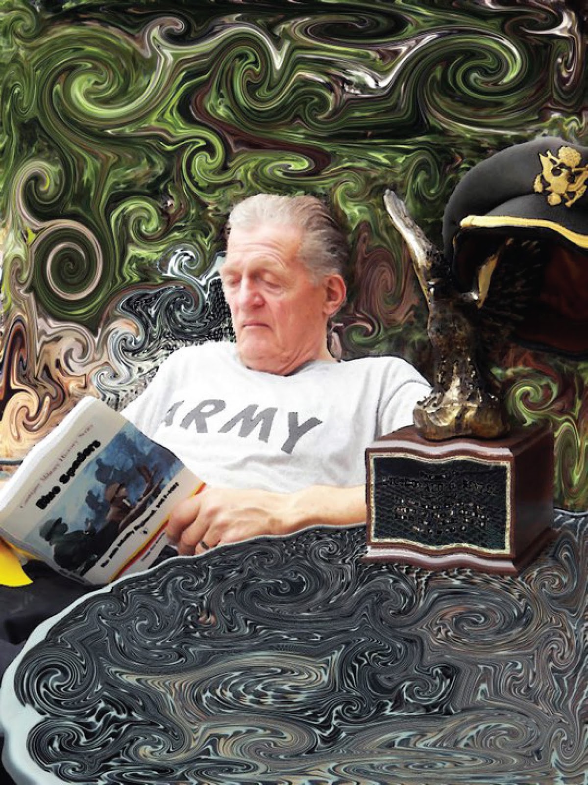
Van Gough Grandpa

"Van Gough Grandpa"

This project I created in a Photography class. I took this picture of my grandfather to then create a Van Gough art piece. The project objective is to imitate your favorite artist. One of my favorites is Van Gough. In this composition I researched how to create a swirl in the background to imitate my favorite painting my Gough called "Starry Night." It was difficult to make the background swirls look professional or on purpose. But once I messed with the hue saturation of the photograph the swirls looked great and got easier to edit. My professor at the time was very proud of my imitation and said she had never seen someone imitate Gough as flawlessly as I had for this composition. Hopefully this picture can get some Army or Military attention in a Graphic Design or Artistic way. Maybe one day this can be a picture they use for a poster for those who want to join the military but want to study art. Thank you and Enjoy.